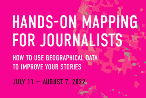
Maps are a powerful visual tool for journalists to analyze geographical data, identify patterns, and make sense of an overwhelming amount of data.
We’ll explore their practical application in our new course, “Hands-on Mapping for Journalists: How to use geographical data to improve your stories” which runs for four weeks from July 7 to Aug. 11, 2022. This Knight Center course will be taught by journalist and instructor John Keefe, who will teach you how to use maps to improve your work as a journalist and digital storyteller. Registration is open now!
“My mapping career started with mapping hurricane evacuation zones in New York City, showing people what parts of the city were vulnerable to a large storm — and then literally helping people identify whether they needed to evacuate as a hurricane approached,” said Keefe, senior data and visuals editor for breaking news climate at CNN. “Maps help tell stories at the national or regional level, but also at the local, personal and immediate level.”
This special course, which is a BOC (big online course), is paid and will be more advanced. Additionally, it is limited to a few hundred students, instead of thousands, like our massive open online courses (MOOCs). Because of the smaller course size, there is more room for interaction between students and the instructor.
As an introduction to the course, Keefe will show you important maps, including some he helped create for CNN and The New York Times. He’ll also introduce you to the services and data used in the course. Students are also encouraged to explore their own data so they can work with it during the course, but it’s not necessary.
“Many people, myself included, learn better when exploring data they already know something about,” Keefe said. “Maybe it's data about the neighborhoods in your city. Or maybe it's a topic you cover, such as poverty or politics. Using data related to things you know about is fun, and you often see both surprising and familiar patterns.”
“That said, you don't need to find your own data to take this class, I have plenty of data for you to explore. So if you don't find your own, certainly don't worry,” he added.
During the course, students will use free features of the following services: Glitch, Datawrapper, Mapbox and Mapshaper.
“With each tool we'll explore, it's pretty straightforward to get satisfying results quickly,” Keefe said. “That means that in our short time together, you can make basic maps and get a foundation for exploring their more sophisticated features.”
The four weekly modules of the course will focus on a specific topic:
- Module 1 covers basic steps for starting a mapping project, including marrying values to shapes and building shape maps in Datawrapper
- Module 2 looks at different formats of geographic data, as well as ethical and data-privacy issues involving with mapping
- Module 3 introduces you to building interactive maps with Mapbox and Glitch, including working with premade “base maps”
- Module 4 explores building maps that can be repeated with fresh data using the free tool Mapshaper
Students don’t need any prior experience with mapping or coding to take this course, but a basic familiarity with spreadsheets and exporting data into CSV files is assumed.
The course will be taught using video lectures, transcripts, readings, discussion forums and quizzes. The course is asynchronous, so you can complete the activities during the days and times that best suit your schedule. However, there are recommended deadlines so you don’t fall behind.
Unlike MOOCs, which are free and attract thousands of people, BOCs cost US $95, including full access to the course and a certificate of completion for those who meet course requirements. There is no formal academic credit associated with the certificate.
“Journalists who want to develop mapping skills, or take their existing skills to the next level, will no doubt get a lot out of this course,” said Mallary Tenore, associate director of the Knight Center for Journalism in the Americas. “Students will be in good hands with John Keefe, who is one of the leading experts in this area and a longtime Knight Center instructor.”
This is the fourth course Keefe, a very popular instructor, has taught for the Knight Center for Journalism in the Americas. He is the senior data and visuals editor for breaking news climate at CNN, and was previously on the network’s Climate Team. Before landing at CNN, Keefe helped with election and Pulitzer-prize winning COVID-19 coverage as a graphics/multimedia editor at The New York Times. And before that, he was investigators editor at Quartz and led the Quartz AI Studio. He also established the Data News Team at public radio station WNYC. Keefe runs the tinkering and teaching company Really Good Smarts LLC, and has taught at the Craig Newmark Graduate School of Journalism at CUNY, as well as other universities.
Don’t miss out on this opportunity to learn from Keefe and set out on your journey to making visually appealing and educational maps that will help make sense of and explain your reporting. Register today!
"course" - Google News
June 22, 2022 at 12:32AM
https://ift.tt/2Eb5mxj
Add mapping skills to your journalist toolkit with new online course from the Knight Center | Knight Center for Journalism in the Americas - Knight Center for Journalism in the Americas
"course" - Google News
https://ift.tt/sGHaADJ
https://ift.tt/JXuYQfK
Bagikan Berita Ini


0 Response to "Add mapping skills to your journalist toolkit with new online course from the Knight Center | Knight Center for Journalism in the Americas - Knight Center for Journalism in the Americas"
Post a Comment